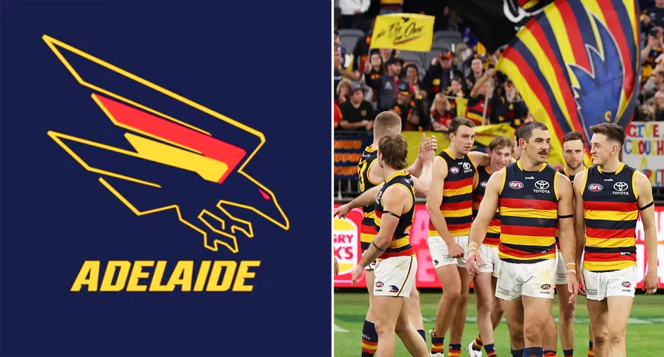
Despite fans slamming the logo when it was leaked in September, the Crows made it official on Wednesday.
Another fan commented, “Cancel my membership and those of my family and friends, who have all been members for 25 years. There were at least 15 other people on Twitter who designed better logos, but you ignored them and stuck with the one we all disliked.”
A third fan expressed frustration, adding, “You clearly don’t listen to your supporters. What’s wrong with you? Didn’t you hear all the recent negative feedback? Yet you ignored us and pushed ahead with it. I couldn’t be more disappointed with this club—‘pissed off’ is an understatement.”
Adelaide dismisses claims they don’t listen to members
But Adelaide chief executive Tim Silvers said a new logo was something Crows members have said they wanted and was a major reason why they undertook the modernisation of the logo. “The logo is one of the Club’s most recognisable features and our supporters take great pride in it, and the throwback to the original swooping Crow reinforces our connection to this city and state by the way it now incorporates the actual shape of South Australia,” Silvers said in a club statement.
“We aimed to honor our heritage while introducing a modern look that we believe will connect with the next generation of supporters.
Over the past 18 months, we’ve consulted and listened to a diverse range of stakeholders, especially sections of our supporter base. With our new headquarters at Thebarton Oval nearing completion, this is the ideal moment to make the change, marking the beginning of a new era.”
